
Glock Redux
As a design professional, I care greatly about good design. As a firearms enthusiast and almost-daily shooter, I care about quality gun manufacturing and reliability. Given these concerns, I own, carry, and train with Glock pistols exclusively.
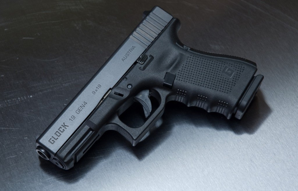
Glocks are the most reliable firearms on the planet. Additionally, they are unadorned by the useless and dangerous features and controls found on many popular pistols. This makes a Glock pistol the perfect carry choice for the pragmatic and responsible citizen. But that logo, though.

Just look at the Glock pistols in these color photographs (above). They deserve something better than the terrible logo!
A Glock pistol is plain, elegant in its simplicity, and serious. The Glock logo is …well, it’s bad. The logo is neither plain nor elegant nor simple nor serious. In fact, it’s rather silly. From a design standpoint, the Glock logo is awful design. The type—for both the name and the tagline—is ill suited to the characteristics of the brand and the products. In short, to see the logo is to understand nothing about the brand or the products. As a designer, this fact disturbs me every time I see the logo. It eats at me. So I decided to engage in a logo redesign as a cathartic exercise. This exercise is for me, but I thought some of you might enjoy it, too.
Problems With the Branding
The Glock brand is carried entirely on the shoulders of the products; the pistols, in specific. The current logo is a silly and contradictory intrusion into the brand. It is a needless liability.
Glock’s visual branding is …well, it’s all over the place. There are many typefaces used, and in various ways, and none of them pair well, look good, or represent the brand well. For example:

This is a mess. Too many typefaces used too many ways, and with too little consideration for branding.
The only interesting feature in these examples is how the Eurostile Extended font “0” is somewhat similar in shape to the “G” of the current logo. One wonders if that was the origin of the shape for the “Glock” logomark. This shape is also mildly similar to the back end of the slide on a Glock pistol. We’ll circle back to that in a bit.
Glock’s demonstrable or visible characteristic adjectives include:
- plain (almost spartan)
- simple
- elegant (in simplicity)
- blocky (the common pun for Glock is to call it a Block)
- efficient
- reliable (boringly so)
- classic (Glocks have changed very little over the years)
- solid
- serious
- hard (very little is done to soften a Glock pistol’s lines)
The current Glock logo is busy, complex, and visually anxious. Lines are not serious or solid, but whimsical and fragile, and lines within lines speak to complexity, not simplicity. The rounded ends of the type seem juvenile; this font would make a good one for a children’s book. It is badly used as logotype for a firearm brand.
We need something solid here; something simple and plain, but serious and substantial, like the lines and shapes of the product. Let’s redo this logo.
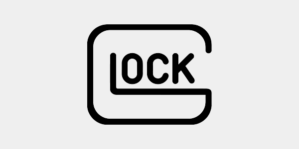
Glock Redux
I’ve long believed that Glock’s logotype should have weight to it. It makes sense that the font’s shape should reflect the product in some way—much like the current logomark is somewhat similar to the slide shape, but without silly aesthetic or light lines. Here’s what I first looked at:
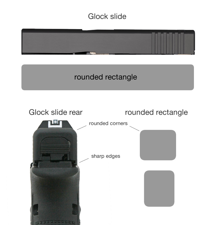
This was feeling right, so I started to try typefaces and later moved onto just drawing the letter shapes. I aimed for the more vertical or square aspect rather than the literal horizontal rectangle shape. I tried to find a way to represent both the rounded corners and the sharp corners…
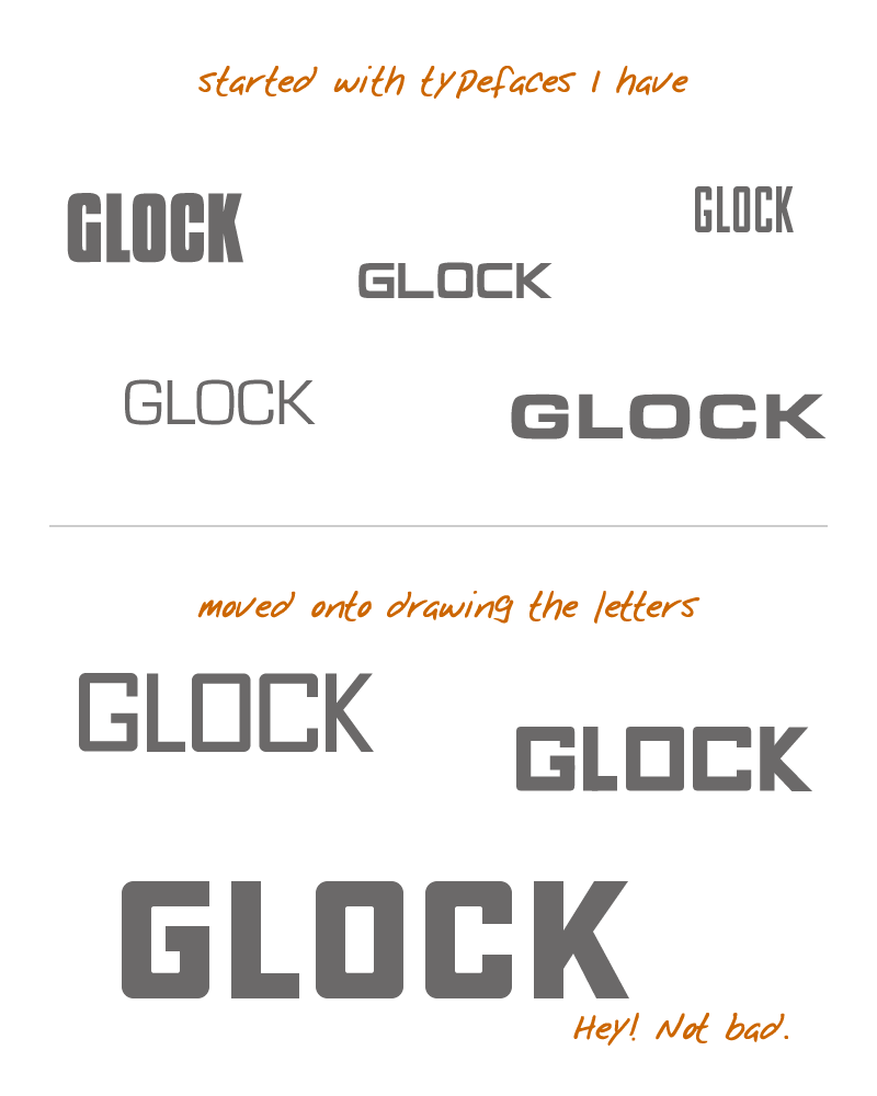
With the last effort at drawing the letter shapes, I landed on what I thought had the right combination of width and height, rounded corners and sharp edges…and it even looked a little retro. What it didn’t have was an element of distinctiveness. I played around with a few things, but settled on a deformation of the “G” character as the point of distinction.
So after more trial modifications and iteration, I landed on this for the Glock logo redux:

In seriousness, which of these looks like perfection to you?

The tagline font hearkens back to something similar to what Glock used in the 30-year anniversary media. Their choice was Eurostile Extended, but I’ve opted for Eurostile. It has a similar feel and shape to the new logotype shapes and utilizes precedent. Somewhat.
Here’s the full complement of logo uses:

…on Glock pistols, I’ve neither reimagined nor greatly repositioned the text elements. I just changed the logo and the info typeface (from Arial or whatever to Eurostile)…


[I believe the original photo above was taken by Mr. Colion Noir]
And let’s not forget swag:

Conclusion
Okay, that was fun. For me, at least. I know one should not go seriously messing with a company’s branding, but this is not serious. It’s just some fun and catharsis for me. I took all of about 5 hours to think about, do the exercise, create the graphics, and write this article. A real logo redesign would take weeks or months and the result would likely be far better than this. But if you’re a designer this all might give you something to consider, and if you’re a designer shooter this all might give you something to dream about.
in seriousness, I do hope folks at Glock, Inc. think about these things and in the future and work to bring a respectable or even mildly appropriate logo to their august brand. In the mean time, we’ll have to live with a crap logo on great pistols.